Pepsi logo evolution
27th Oct 2008
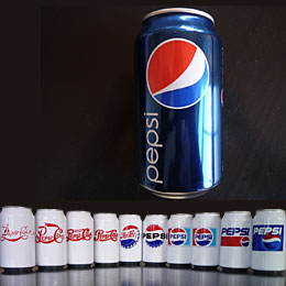
The evolution of the Pepsi logo. Amazing how similar it was to the Coca-Cola logo when it first started out. I rather liked the bottle cap stage (around about can 5 and 6).

27th Oct 2008
The evolution of the Pepsi logo. Amazing how similar it was to the Coca-Cola logo when it first started out. I rather liked the bottle cap stage (around about can 5 and 6).