A new design for The Letter
23rd Oct 2007
Clear out your cache 'cos I've got a new design for you!
It hasn't got a name or a version number (must be around V5 now, tho' who's counting?). So, what's new? Well other than the visual overhaul a few minor updates to the codebase but generally-speaking nothing too drastic. Here's a quick list for lazy readers:
- A lovely new design
- Image-based posts
- Categories
- Bookmarkable individual posts
- Comments on posts
- MySQL Fulltext search
- Subscribe to content by email
- 'Possibly related' posts
- 'The best of The Letter' posts
- A new 'about' page
- A new backend
A lovely new design
I had this idea of doing a wicked worn design but ended up with the sheet of paper metaphor. I'm not disappointed though, I think it works well except in one area: image sizes. The design makes (extensive?) use of PNGs and thus proves to be quite a drain on the first-time visitor (unless you're using IE 6 and you actually get a speedy but plain-looking site - because support for PNGs is so ropey in IE 6 I opted to serve up a simplified version to those users; ha! serves them right). Anyway I'm hoping that the fresh and clean design will make up for the initial wait for the images to download. What was your experience of downloading the new design for the first time? Slow? Fast? Ok?
Content-wise not much has changed and to be honest, all I've done is realign things to make them easier to read and navigate round.
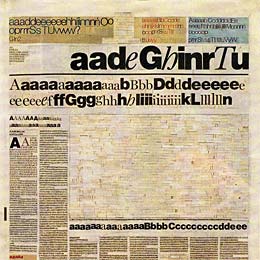
In case anyone's interested, the font I've used for 'The Letter' heading is called Big Limbo and the font I've used for the heading 2 + 3 + 4 tags is one of the new Windows Vista fonts called Candara - which I'm really keen on.
Image-based posts
Posts will now come accompanied by an image (tho' not every post). I think adding an image can help to retain visitor interest as well as looking cool. Also, first impressions are better and this is important because most of my visitors are Letter virgins.
Categories
Posts were always categorised before but I never really used this meta data except for generating a unique RSS feed for each. Now posts can be viewed by category which is a wonderful addition for me personally but I realise this is pretty basic stuff in terms of blogging these days. Overall though it's a great tool for helping those first-time visitors hang around on the site a little longer.
I've tried to display the categories as a tag-cloud but I just can't get it to look any good - at the moment it looks more like a discarde newspaper that been soaked in the rain and driven over by a few cars.
Bookmarkable individual posts
Although each post previously had it's own unique URL it wasn't intuitive to find, therefore making it rather difficult for people to reference specific posts in their own blogs - which should be the sole aim of all bloggers, no? :-)
So now each post has it's own easy-to-find page (just click the post title) which can be bookmarked and commented on. Hopefully this should help Google and other search engines index the site better.
Comment on any post
Got something to say, even if it's just a couple of words? Feel free to add your thoughts to anything that gets posted. I'd like to encourage more commenting; quite a strange decision in today's frenzied climate of comment spam I hear you think? Och well. My comment form is a hacked version of Mike Cherim's Secure PHP Contact Form; used in an effort to cut down on the spam, even though everything's moderated before publication anyway. So although spamming's a waste of time if it gets too much to handle I'll look into installing something like Aksimet.
MySQL Fulltext Search
I've started using MySQL's built-in search function for searching The Letter. I'll see how this fares over the coming weeks. Feedback is appreciated.
Subscribe to content by email
If RSS isn't for you then you can now receive notification of all my posts as a daily email digest. This is a free service provided by Feedburner.
'Possibly related' posts
This is a significant work-in-progress. The plan is to display three posts related to the currently selected post. At the moment I'm just displaying the last three posts in the same category but my eventual plan is to use 'tags' to work out what's pertinent. The problem is that my older posts are not 'tagged'! So, I'm going to (slowly) work through the back catalogue and weed out the dead posts (the ones with serious link-rot - and there's a quite a few) and add in suitable tags. I don't think there's anything wrong with doing this, is there?
'The best of The Letter' posts
I've gone through all the posts and personally selected the best ones. They will display randomly at the bottom of each individual post.
A new 'about' page
I had a bit of fun writing the new 'about' page, do check it out :-)
A new backend
I've added my own CMS to the backend of the site. This makes managing the blog much easier in terms of moderating comments, making and editing posts, uploading images and changing the random quote that appears in the search field.
(NOTE: my CMS is for clients only and the link above goes to a holding page for the site, which I'm still working on content-wise)
Caveats
Ok, some of you may already have noticed that I've opted for a fixed 1000px-wide design which leaves a scrollbar on smaller screen resolutions. I struggled long and hard with the decision to do this, especially as I'm a strong advocate for accessible web design. So why you may ask? A couple of things:
- According to my statistics just 2.6 percent of my visitors use a screen resolution less than 1024 x 768. I thought this number was small enough
- The design called for it - I wanted something to hold three images across the page. Not two and not four or five or six. During development I had originally planned a 100%-wide design, with the layout changing according to the screen resolution. In theory it worked, in practise it didn't: it was lousy and ununpredictable
Also, I'm aware of the Javascript problem of not being able to tab into the categories and subscribe boxes: I'm working on it - I'm getting some JavaScript help on this :-)
To do list
- Style sheets for handheld devices and print
- Fix the JavaScript issue for keyboard users
- Embellish posts with additional meta data / tags
- Fix search results - some results produce invalid markup (although no real visual issues)
- And any decent suggestions from my readers :-)
Feedback appreciated
I'd love to hear your feedback on the changes I've made. Please don't shoot me down in flames because of the fixed-width.
Possibly related?
Based on the tags from this post.
The Letter Museum

- up ↑
- typography
- 27th Jan 2009
The Old Letter
- up ↑
- typography
- 10th May 2009
Grungey design

- up ↑
- web design
- 29th Jan 2008