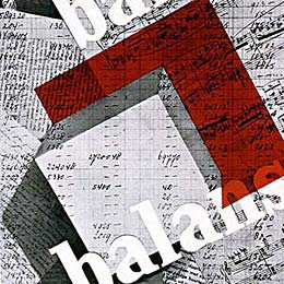
New Graphic Design layout
14th Mar 2007
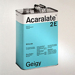
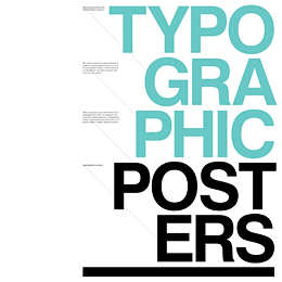
Early classic example of a New Graphic Design layout using only two colors, (a two color run for a printing press is much cheaper than full color) but was an exciting visual utilizing space, tension, asymmetrical layout, san serif letterform and photography.

